4.3 Override Bootstrap Styles
Inspect Bootstrap
Section titled “Inspect Bootstrap”Review these steps to inspect Bootstrap in DevTools before you attempt to override.
- Use DevTools to inspect the CSS breakpoint and color classes that Bootstrap adds to the root element
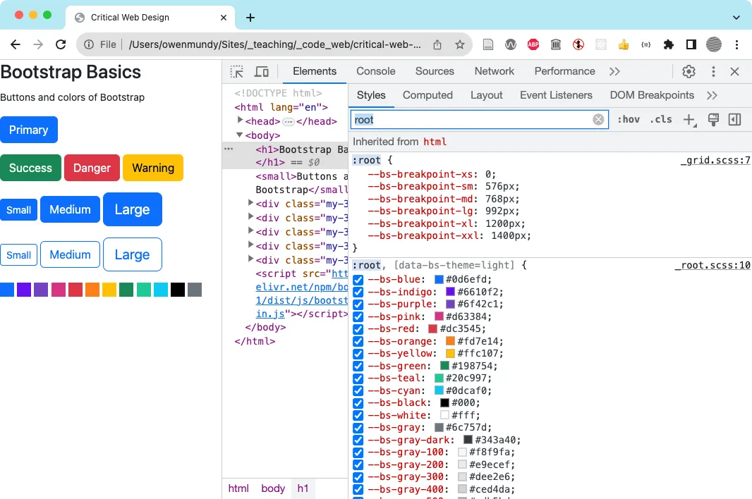
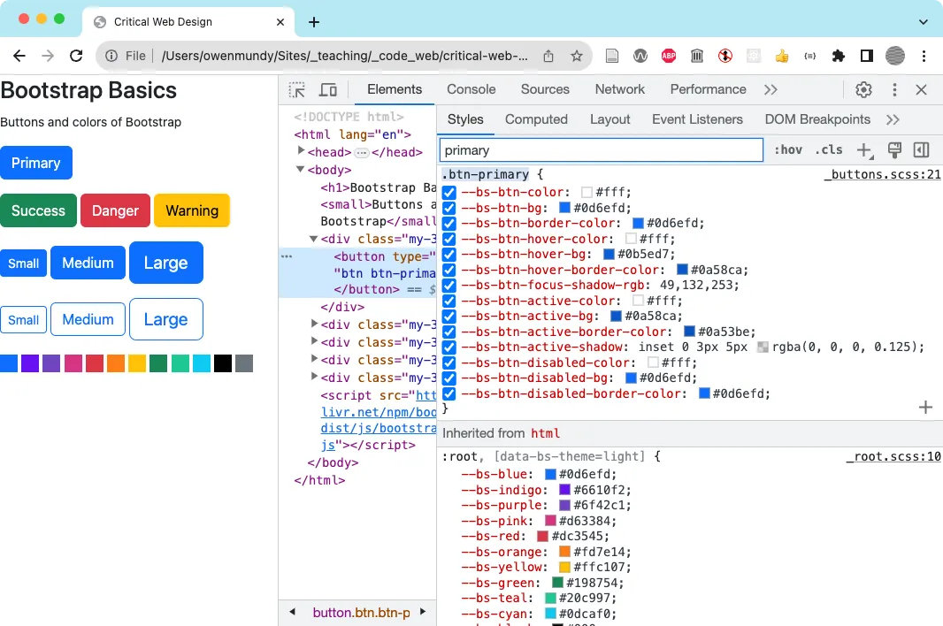
- Use DevTools to see Bootstrap’s btn-primary class custom properties.
Override Bootstrap Styles
Section titled “Override Bootstrap Styles”There are generally two ways to override Bootstrap styles. The Bootstrap documentation usually shows customizations using Sass variables. As we discussed, this requires extra setup to recompile the CSS and is really more appropriate for large projects. The method we’ll show below applies to the pre-compiled version we’ve been using so far from the CDN. You will use DevTools to identify the classes you want to override and simply add your own rules, just as you normally would with CSS.
- Open
on-the-grid/index.htmlin Chrome. - Add the following CSS rule to change the background color of all elements that use the
btn-primaryclass from the default blue color to purple. The additional!importantrule will add more importance than normal rules for that property on that element.
.btn-primary { background-color: purple !important; }- Thanks to the CSS cascade, the above method works as long as you add it after you incorporate the Bootstrap CSS file. But, as you can see, it doesn’t cover all the states of interaction (hover, active, focus, etc.). This is because you haven’t added rules for each of the interaction pseudo-classes. While you could do that, you would be creating repetitious code. Instead, you’ll keep your code “DRY” by overriding the custom properties in the main
btn-primaryclass. Start by commenting out the rule you just added, then save your work and refresh the page in Chrome. - As you did in the previous exercise, inspect the “primary” button and find the rule for the
btn-primaryclass with the custom properties. Since your previous rule was removed it should be blue again. Copy/paste the rule from DevTools into your<style>element in index.html. - To override the colors used by the button you simply need to update these colors. As a test, set
--bs-btn-bgusing any of the named web colors https://en.wikipedia.org/wiki/Web_colors . We assigned the colorslateblue. Save and refresh your work.
.btn-primary { --bs-btn-color: slateblue;}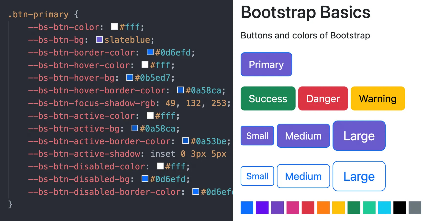
- This works, but you still have to enter the same color name several times because some of the color values in this rule are being reused. To avoid repetition and make the code easier to update let’s do this using the DRY principle. You’ll need to just define seven custom properties, several of which are reused across all the interaction states. Add a
:rootrule above the.btn-primaryrule. Then type the following seven custom properties. These properties could be any name and color. We named them using a fruit followed by the name of the first time it was used in the class. The first two colors are for the text and the five following colors are variations of orange that are progressively darker to match how Bootstrap’s hover effect works on other button classes. It was easy to create these variations with the color picker tool in Visual Studio by adding the first orange color to all of them and then selecting and slightly dragging the color picker interface to find one just a tad darker in value each time. Experiment as needed.
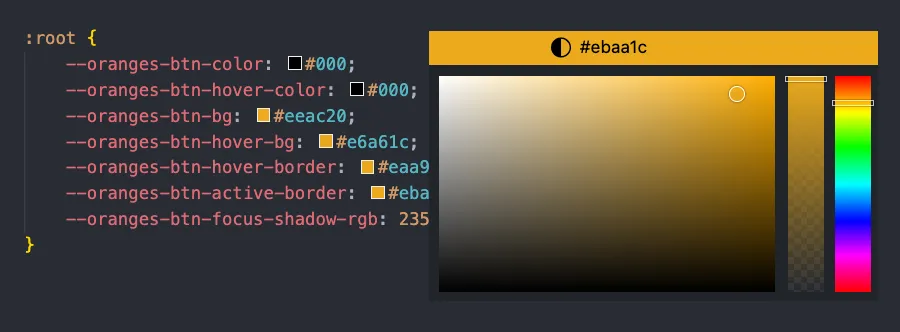 You can select a color with a color picker tool in Visual Studio Code by clicking on the color chip next to its hex value or name in the stylesheet.
:root { --oranges-btn-color: #000; --oranges-btn-hover-color: #000; --oranges-btn-bg: #eeac20; --oranges-btn-hover-bg: #e6a61c; --oranges-btn-hover-border: #eaa91e; --oranges-btn-active-border: #ebaa1c; --oranges-btn-focus-shadow-rgb: 235, 170, 28;}- Now that you’ve added these definitions you can override all the defaults for
.btn-primaryusing the CSSvar()function. Update the rule as we did below and in then save and refresh your page in Chrome. You should see the color has been updated for all of the different states of interaction, including focus, which you can check by clicking on the page and tabbing through the buttons.
.btn-primary { --bs-btn-color: var(--oranges-btn-color); --bs-btn-bg: var(--oranges-btn-bg); --bs-btn-border-color: var(--oranges-btn-bg); --bs-btn-hover-color: var(--oranges-btn-hover-color); --bs-btn-hover-bg: var(--oranges-btn-hover-bg); --bs-btn-hover-border-color: var(--oranges-btn-hover-border); --bs-btn-focus-shadow-rgb: var(--oranges-btn-focus-shadow-rgb); --bs-btn-active-color: var(--oranges-btn-hover-color); --bs-btn-active-bg: var(--oranges-btn-hover-border); --bs-btn-active-border-color: var(--oranges-btn-active-border); --bs-btn-active-shadow: inset 0 3px 5px rgba(0, 0, 0, 0.125); --bs-btn-disabled-color: var(--oranges-btn-hover-color); --bs-btn-disabled-bg: var(--oranges-btn-bg); --bs-btn-disabled-border-color: var(--oranges-btn-bg);}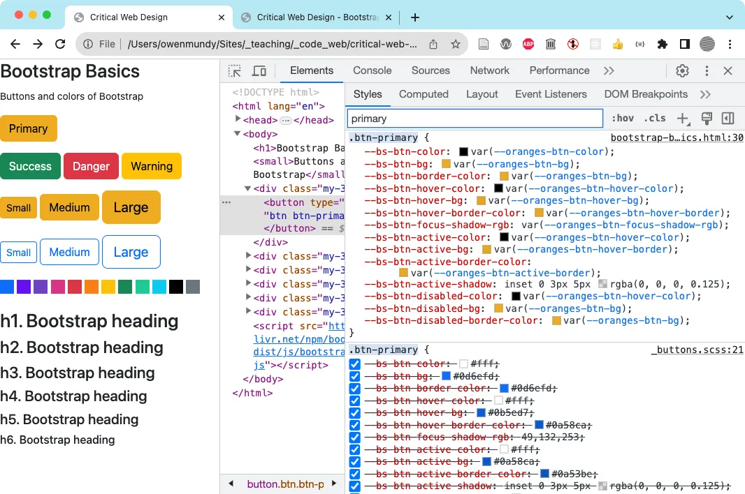 This screenshot shows our custom properties in DevTools.