4.3 Bootstrap Grid System
Intro to Bootstrap
Section titled “Intro to Bootstrap”A quick guide to using Bootstrap components.
- Go to https://getbootstrap.com/
- Click on Docs https://getbootstrap.com/docs/5.3/getting-started/introduction/
- Scroll to code example #2 and copy/paste this code (with the CSS and JS links already in place) into a new HTML document or Codepen.
- Click on Components > Buttons and paste in some example buttons https://getbootstrap.com/docs/5.3/components/buttons/
<button type="button" class="btn btn-primary">Primary</button>- Note the class names of other button variants. Change your button by editing the class name only.
<button type="button" class="btn btn-success">Success!</button>Grid Features
Section titled “Grid Features”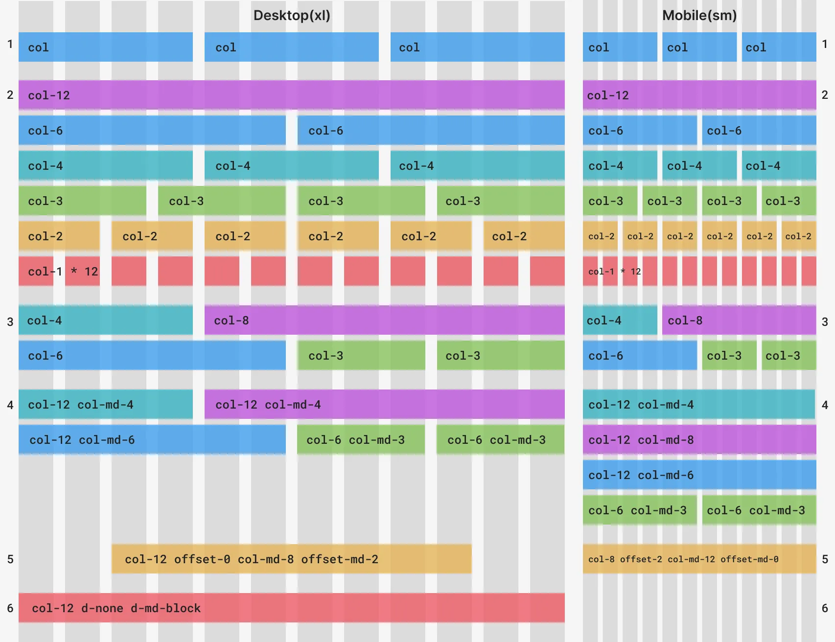
- Bootstrap’s
.container-fluidclass always expands to the full width of the window, while the.containerclass has a maximum width. The.colclass will expand to fill the width of the row on that container. Add multiple columns (in this case 3) and you will see that number of equally-sized columns per row. - The
.col-{rows}classes will take up only as many of the 12 Bootstrap columns as you define. The only rule is that the column and offset spans together add up to 12. - Mix and match Bootstrap column sizes however you like.
- The
.col-{breakpoint}-{rows}classes span the Bootstrap columns, but only on the breakpoint you define (and larger). So, while example#3.col-4remains the same, in example#4.col-12 .col-md-4defaults to the full width, except on medium breakpoints and higher. This allows for different layouts with the same content across different device sizes. - The offset classes can center the columns in a container.
- There are also helper classes to control how elements are displayed.
Coding Bootstrap Grids
Section titled “Coding Bootstrap Grids”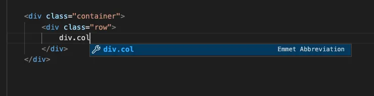 Most editors let you type the beginning of an HTML element and press tab to add the open and close tag you want. This feature also lets you add HTML elements with their class names by typing the full name of the selector.
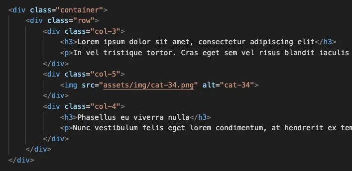 A three column layout coded.
Creating Consistency
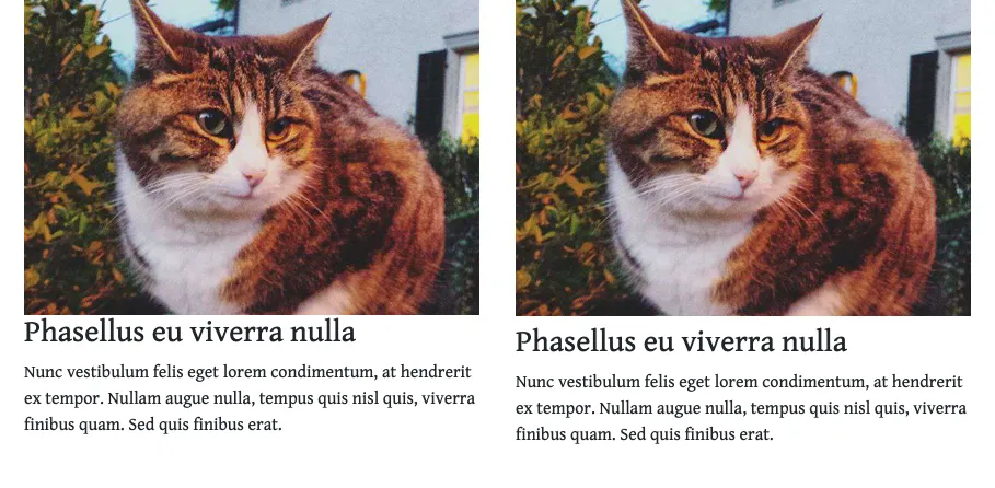
Section titled “Creating Consistency”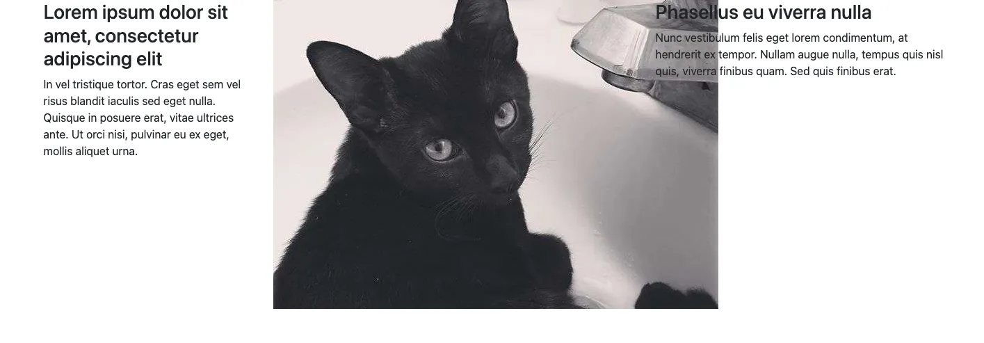 The image in the second column is not scaling or reflowing like the text.
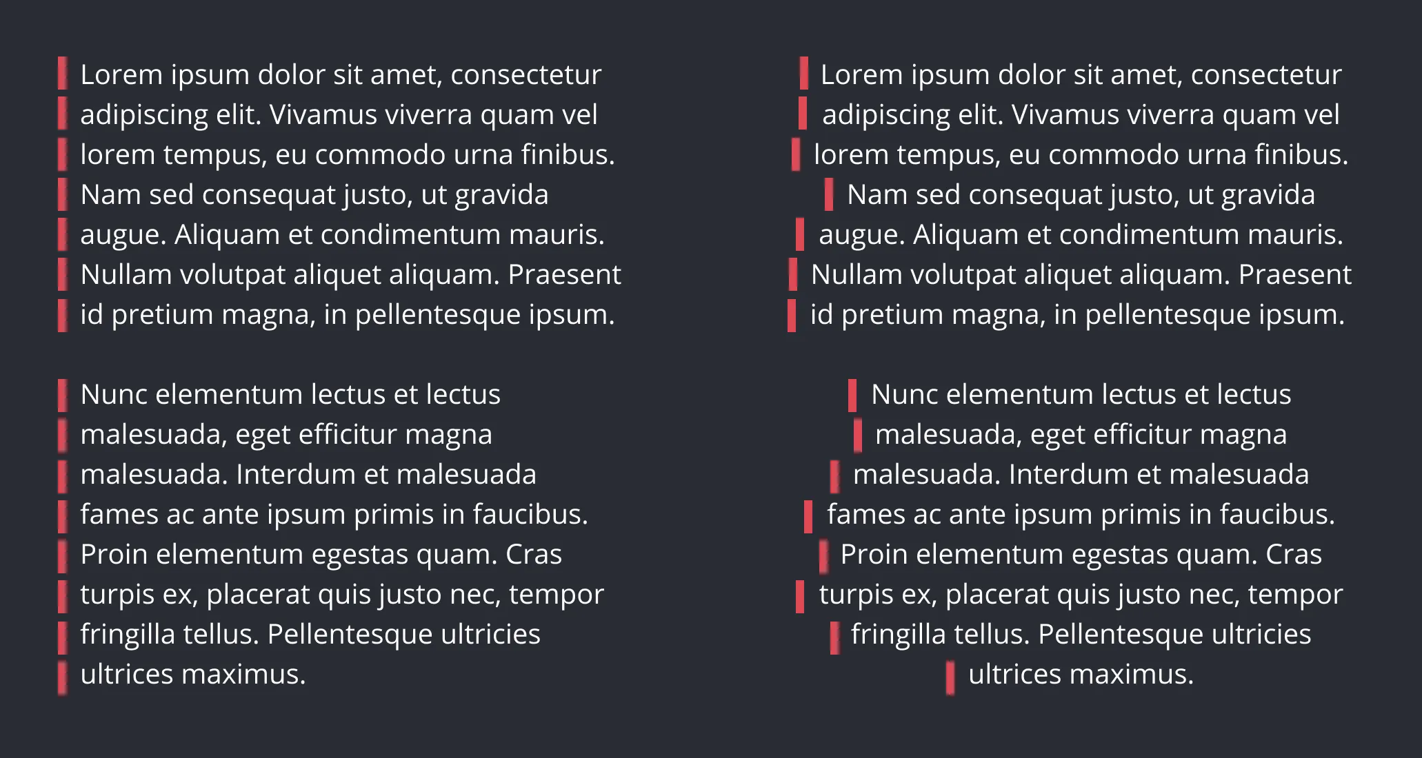
 Notice the difference in negative space before and after we added top margin to the heading.
 Notice that, aside from the masthead (the name of the publication), all text is left-aligned. Left aligned text has a straight edge on the left side that helps readers scan and find content. And, it’s easier to read because each line starts at the same horizontal origin, whereas center-aligned text has a ragged left edge causing readers to search for the start of each line.
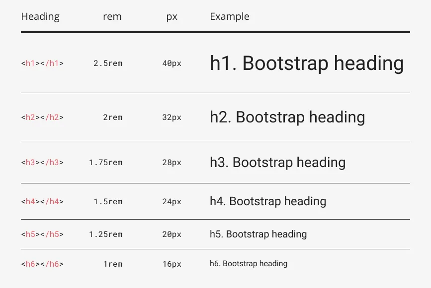 The headings in the Bootstrap framework scale at consistent values.
Finished Prompt
Section titled “Finished Prompt”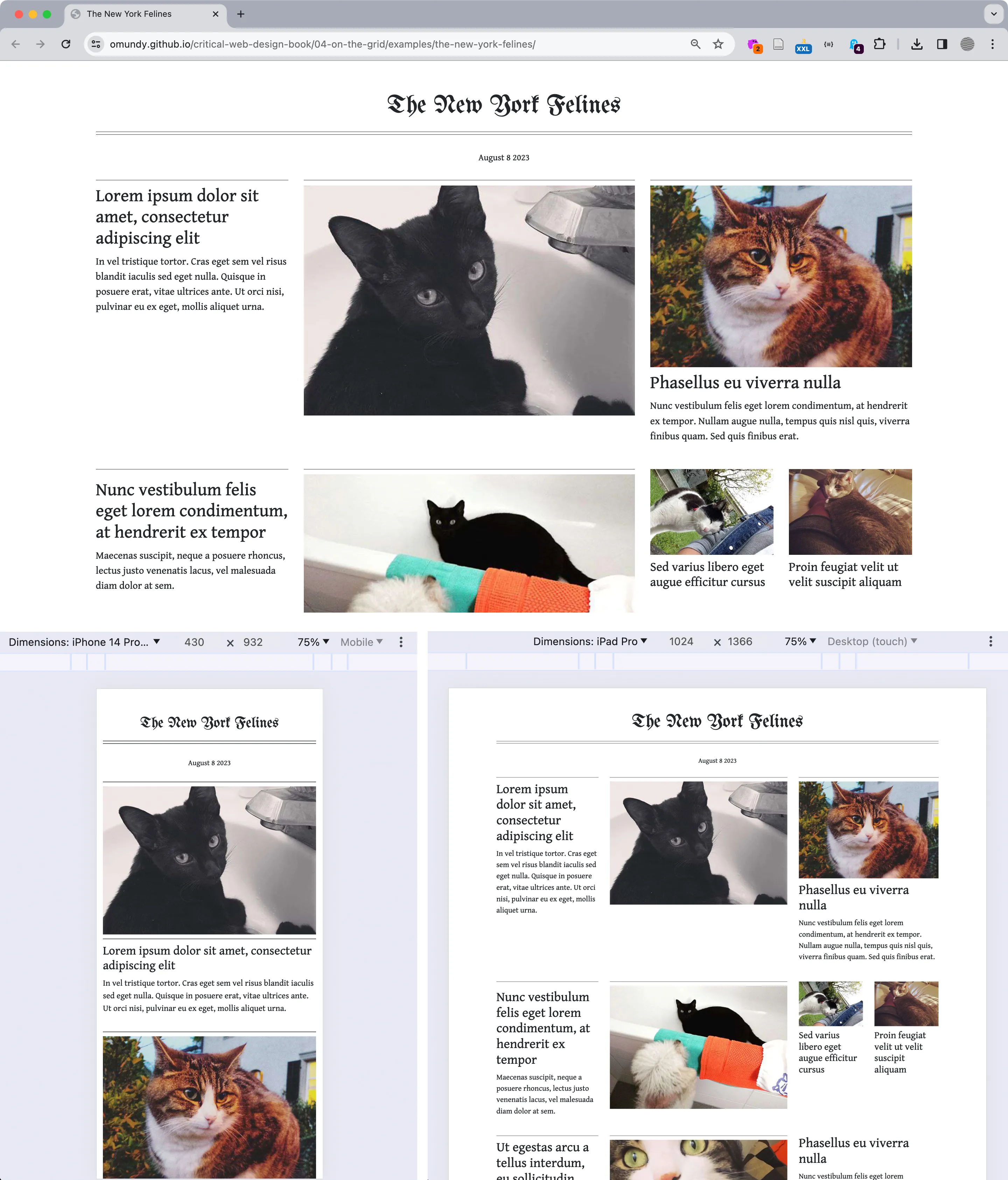 Our final composition https://criticalwebdesign.github.io/book/04-on-the-grid/4-3/index.html for multiple breakpoints seen in the browser with DevTools. The Toggle Device Toolbar (see the cursor in the upper right corner of the top image) enables you to view your work across multiple devices in the Chrome browser.